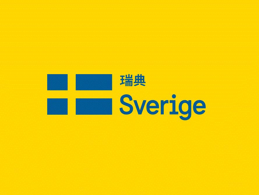
Sweden’s 2013 logo design, which was made in several different languages, is an example of location branding.
Boy, was 2013 a fun year for branding nerds. From art museums to operating systems, we saw some truly bold and risky design moves – some of which paid off, others of which crashed and burned at an epic scale. Looking at the trends that gained traction in 2013 also gives us an idea of what to expect in the year to come. Here are four of my big predictions.
Trend 1: The branding of branding
As graphic designer Michael Bierut pointed out in his article Graphic Design Criticism as Spectator Sport, it was not so long ago that lay consumers hardly would have recognised “branding” as a discrete concept, let alone a topic fit for dinner table conversation. Those days of innocence are gone.
Bierut wrote his article last January, in the wake of the University of California withdrawing a new logo design in response to vocal public disapproval. In the year that followed, plenty of other logos suffered the slings and arrows of outraged public opinion (for example, the citizens of South Australia seemed none too pleased with the design adopted by their region’s tourism bureau), and some have followed the UC’s suit, aborting their new identity designs altogether. American clothing retailer JCPenny and fast food chain Arby’s scrapped unloved new logos and reverted to old branding elements or very similar ones.
No wonder, then, that in 2013 we also saw major corporations begin to anticipate their rebranding efforts becoming a matter of public concern. Most notably, Yahoo! prefaced the unveiling of its new logo with a 30-day hype campaign in which they released a different, unofficial logo possibility each day – an exercise in branding one’s own branding, if you will. In the year to come, I think we can expect more such efforts.
Trend 2: A world of colour
The single most impactful design move in 2013 had to be Apple’s release of the iOS 7 operating system. Folks had been debating the virtues and vices of “flat design” – a UX design style that eliminates mimicry of 3D surfaces (beveling, gradients, drop shadows, etc.) in favor of a more minimal approach – for months, but Apple really put its money where everybody else’s mouths were. iOS 7 is emphatically flat. It is also very, very colourful.
The two developments are related. A design both flat and dull would be just too austere; take away texture and depth, and you have to replace it with some other appealing visual morsel. Colour fits the bill, especially with ever-improving retina displays allowing for new brilliance and clarity.
Need more evidence of this trend? Consider Microsoft’s recent rebrand, which included a transition from a black, monochrome wordmark to a logo with a flat, four-color window. Microsoft-owned Bing has followed suit, switching out a cool blue for a more vivid yellow. As Google’s logo flattens, its colors brighten up too, and Motorola (now “A Google Company”) sports a snazzy multi-color ring. I think we can expect a world of color in 2014, definitely in the tech sector and perhaps beyond.
Trend 3: Adaptation is the new norm
Last year, the Whitney Museum of American Art unveiled a new identity design by Dutch studio Experimental Jetset that actually felt avant-garde. As a default it consists of a “W” zigzag and the word “Whitney” in capital bold letters, but its most exciting attribute is the fact that it actually has no essential form: the zigzag is built to expand and contract in any number of orientations to provide nooks for various combinations of text.
Thus it can adapt to its environment, whether that be digital or physical, of any shape or size.
Experimental Jetset was certainly not the first to have such an idea (the MIT Media Lab rolled out a logo back in 2011 with a staggering 40,000 algorithmically-generated permutations), but the Whitney re-design brought the strategy into the limelight in a way that predecessors did not. My guess is that in 2014 more and more companies will follow suit. Just as web pages become increasingly responsive to different screen sizes, ranging from iPhone to desktop, logos too will take on a newfound flexibility.
Trend 4: Brands are going places
With the transition from industrial to primarily service-based economies, tourism becomes ever more important. So naturally the marketing wheels begin to turn, and that means branding – in this case, of places or “destinations.” It is not a new phenomenon for tourist destinations to adopt a logo, but they haven’t been much to write home about. After all, a city like Paris sells itself; you don’t need a drawing of the Eiffel Tower for added impact. But what about when more unconventional destinations want to start vying for travelers’ interest? Suddenly, branding is key.
2013 brought this trend to its greatest intensity yet: Sweden rolled out a new logo for itself, and so did Minsk, South Australia and Colorado (the former two to acclaim, the latter two … not so much). Additionally, place branding has begun occurring on an increasingly small scale. Victoria district, a small but central neighborhood within London, acquired a design identity of its own in 2012, and this past year Grand Central Station, a terminal in New York City, celebrated its 100th anniversary with a revamped logo. Maybe in 2014 we’ll see the first roundabout with a brand of its own.
It will be interesting to see if 2014 meets my branding predictions. But more than anything, I’m excited to see what unexpected trends are on the horizon. What’s your forecast?